
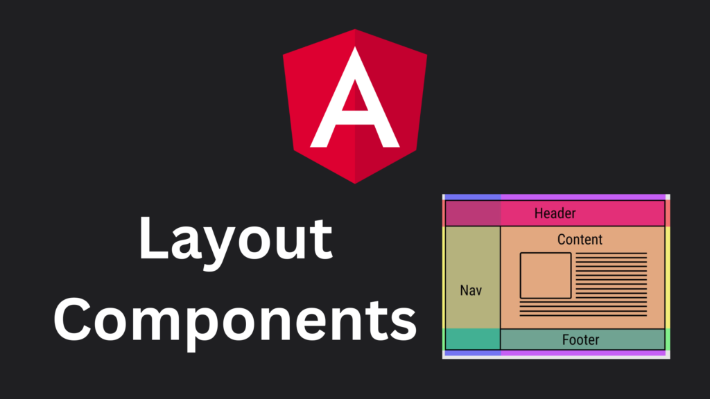
Sharing layouts between components is a pretty common use case (e.g. dialog components with a title, content and buttons). Global CSS classes are one way to share styles and therefore layout styling. Especially in larger projects, global CSS classes need a lot of love and discipline to not get messy. Layout Components are an alternative solution for layout sharing. This blog post will show you how to create reusable Layout Components by leveraging Angular’s content projection.
What are Layout Components?
Layout Components are Components that make use of Angular’s content projection to place one or multiple contents in the correct space. A simple example would be a layout component that defines a header, a body, and a footer. If such a layout is used in multiple different locations, Layout Components allow us to style it once and reuse it without creating global classes.
An applied layout component could look something like this:
<app-content-layout>
    <app-header slot="header" />

    <app-dashboard />

   <app-footer slot="footer" />
</app-content-layout>
This results in very declarative HTML where we not only see the used components but also where they are placed within the layout, similar to well named global CSS classes.
How do I create a Layout Component?
First, we need to create a new component with the Angular CLI ng g c content-layout.
Within the component’s HTML, we define different blocks. On these blocks, we apply Multi-slot content projection. In this example, we define a Header and a Footer slot. For the content, we use the default slot. Therefore, no slot name for the block content needs to be defined.
<div class="header">
    <ng-content select="[slot='header']" />
</div>

<div class="content">
    <ng-content />
</div>

<div class="footer">
    <ng-content select="[slot='footer']" />
</div>
Note: Technically, the slot keyword is not needed, and we could use header or footer directly. I like using it because, in my opinion, it leads to better readability within the HTML. I always know that slot is associated with a layout component.
Now we have to style the slots. In this example, the header will have a height of 80px and the footer a height of 50px. The content should take up the available space. In a flex container, this can be achieved by setting the shorthand property flex to 1.
:host {
  display: flex;
  flex-direction: column;
  width: 100%;
  height: 100%;

  .header {
    height: 80px;
  }

  .content {
    flex: 1;
    overflow: auto;
  }

  .footer {
    height: 50px;
  }
}
That’s it, the layout component is ready for use like shown in the example above.
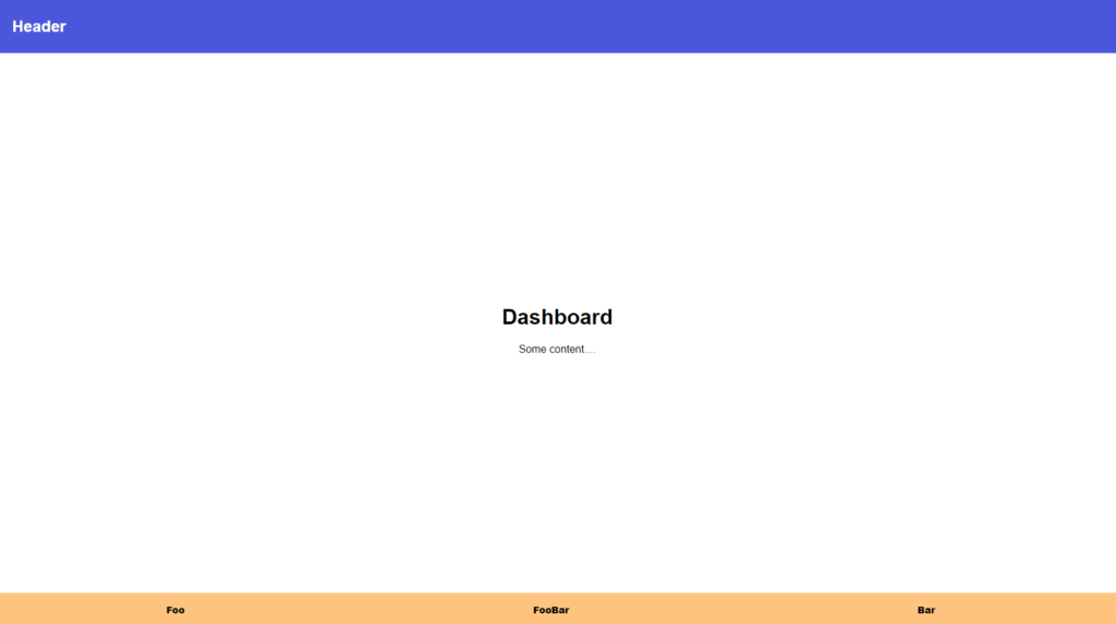
Result
To showcase the result, I created a simple header, dashboard and footer component.
The code can be found in my GitHub Repository